Tricks for tile-based terrain

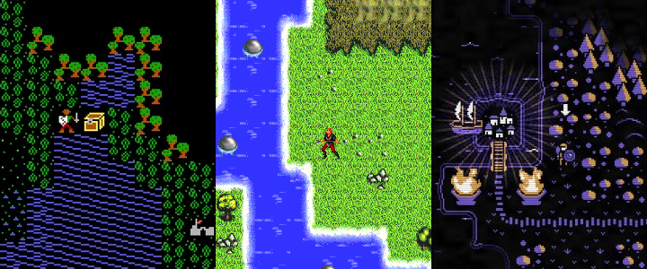
Above: Ultima IV (1985), Exile III (1997), and Moonring (2023).
Tiled 2D graphics are a mainstay of old-school RPGs. Drawing the graphics, creating maps, and writing code to display them is quick and easy compared to 3D game engines. My Overworld graphics set is an experiment in ways to keep the simplicity of 2D tiles without looking like a game from the 80s.
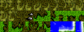
Moonring is a great modern example of tiled graphics, especially in its "outdoor" map. The game uses a five-color palette: black, white, and three mid-tones. Imposing such a tight constraint on the graphics has one major benefit. In Exile, the artist needed to create a tile for every possible transition between two terrain types:

In Moonring, as in Ultima IV, the "background" of every tile is black, so two different kinds of terrain can be placed next to each other without an obvious seam between them. The artist can focus just on creating different types of tiles, not with the drudge-work of drawing every single possible combination between them.
My Overworld graphics started out with that same idea:

One major challenge with tiled graphics is to avoid making the tile boundaries too obvious. I've used three tricks to smooth out the boundaries. First, some objects span multiple tiles. Above, one mountain is 2 tiles wide and the other, 4. Second, objects are allowed to spill out beyond the edge of the tile boundary. That allows the forest tiles to blend together into one solid green mass even though every single tile is drawn individually. It also means that tiles can partly overlap the row of tiles above them.
But then, I ran into a problem with the forests. Each forest tile contains about 4 trees. Trees that are "rooted" higher up vertically ought to be behind trees closer to the bottom of the tile. But sometimes the "overflow" would result in a tree that ought to be farther back being drawn on top of another tree. I came up with a simple solution that works surprisingly well. Even though the grid is square, each tile's "footprint" is a parallelogram:

This ensures that no two tiles have an object in exactly the same place. And because each row is drawn from left to right, farther-away objects are never drawn on top of closer ones. This also lets me overlap the mountains without worrying about them looking like they occupy the same space. (Overlapping the mountains is important because they block line of sight, which would be less convincing if they had visual gaps between them.)
In addition to the tiles, the map has a colored background. This background is just a very low-resolution image, with 2×2 pixels for each tile. The web interface blurs the pixels, but below they're drawn with sharp edges so you can see where they are:

That allows terrain with the same grass tiles to look like grass or desert or even a marshy area, just depending on the color of the background behind it. But, what happens when I need a sharp color transition, e.g. between the yellow sand of a beach and the blue of the ocean? That's the one case where I do want sprites that cover an entire tile. The transition from beach to ocean is always two tiles wide, with the blurry background transition hidden behind the sprites. Below, I filled the whole background with yellow so you can see where the transition sprites end and the ocean background begins:

In this case I did end up having to draw all the transition combinations. These tiles are square instead of parallelograms, to make sure they line up exactly with no visible seam between them. But, to avoid making the repetition too obvious, I created 2- or 3-tile-wide sprites to mix in along the shoreline. That ensures, for example, that every horizontal shoreline is not just the same shape repeating over and over again. (When drawing the map I also intentionally made the shorelines jagged and irregular for the same reason.)
Overworld
Art demo for an old-school RPG
| Status | Prototype |
| Author | Michael Zahniser |
| Genre | Role Playing |
| Tags | 2D, Hand-drawn |
Leave a comment
Log in with itch.io to leave a comment.